We are constantly trying to make ProspectBoss better and while these changes are not huge, they do help make it a little more user-friendly, and the overall look and feel of it more appealing. We hope that you will find these changes useful!
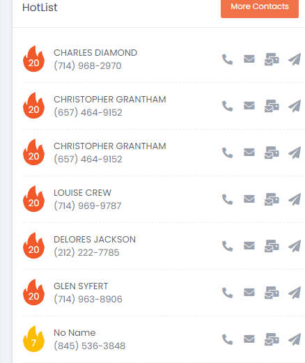
- The first thing we changed was the Hot List. We added fire icons and then color-coded them. Hot leads are scored 25 and above and they have a red fire icon. Warm leads are scored 10-24 with an orange fire icon. And cold leads are 0-9 with a yellow fire icon. Here is an example:

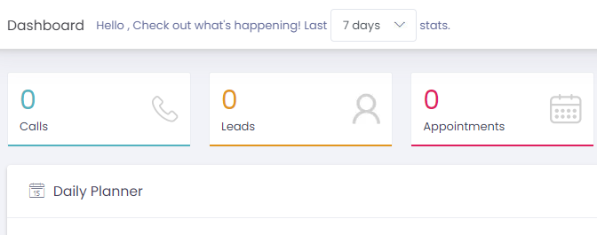
- We also made a couple of changes to the ProspectBoss Dashboard.
We added a date filter to the top so you can choose to see stats for a set amount of time. For example, in the last 7 days or the last 30 days.

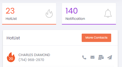
We also added a notifications tile so that you can easily see any new notifications for your account.

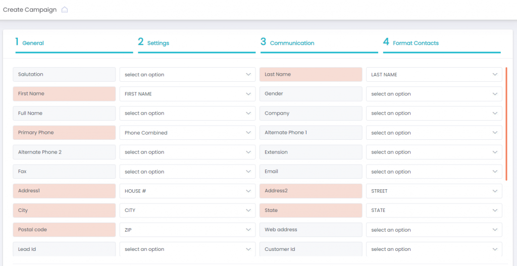
- The last big change we made is when you are creating a new calling campaign, during the Format Contact step, we made the fields highlight orange after it has been filled. This makes the process quicker and easier knowing what you have already populated and what you haven’t.

We hope that you enjoy these changes and that it makes using your ProspectBoss account easier for you. We strive to make your prospecting life more efficient, effective, and enjoyable.